How to make a round Google+ profile image

Maybe you have noticed that some of the profiles in your Google+ circles don’t have the regular square profile image, but instead a round photo. You can e.g. look at my profile image at my Google+ profile:
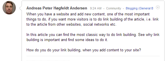
In this article I will explain how you can transform your regular Google+ image to the round image using the free photo edit software GIMP. But why should you make a round image instead of the regular square image? Because this is important if you have established authorship between your website and your Google+ profile. That is because a round image may stand out for the person searching on Google, compaired to the square Google+ images. That will be more eye catchy and may therefore lead to a higher click-through-rate (CTR).
Download GIMP
GIMP is an opensource, free photoeditor just like Photoshop – just for free. You can download it for free here. When you have downloaded it, install it and open GIMP.
Select a circle in your profile image
First you need your regular, square profile image that you want to edit. Then open the image in GIMP, by choosing File and Open. Also create an empty image with a white background, by choosing File and New.
Now you want to select a circle in your original, regular, square image by choosing the ellipse select tool.
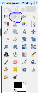
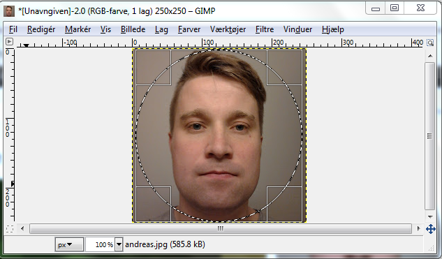
Then select a circle in your original image and press Ctrl + C to copy the circle.
After this, insert the circle in the empty image by pressing Ctrl + V.
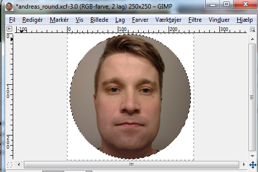
Then save the image as a JPEG image, by pressing File and Export to… (Ctrl + E). Then upload the photo to Google+ and see the result.
The circle image in your posts
The round profile image will show up like this in your posts:

The white background will blend completely into the white background color of Google+.
The circle image on your profile
On your profile your white background might look more distinct from the rest of your profile, but it looks OK.

The circle image in search results
If you have authorship established on your site, the circle image will look like this in the search results:

This looks more professional than the regular, square image and is more eye-catchy. The white background of the circle image matches the white background of Google’s search result page perfectly.
This profile image does not affect your author rank, but making more attractable content and images does affect the CTR of your search results. How big the effect of using the round image, instead of the square, I don’t know. But if you like the round image better than the square and want your profile to stand out from the others, then I recommend you to use it.
You are welcome to follow me on my Google+ profile. Here I will share all the webmaster related articles I made and also others webmaster related articles.


That’s pretty cool! I think it’s a creative way to stand out in the SERP’s, if I could only get my authorship to work after implementing (and tweaking) it eons ago when it first came out…UGH!
Gotta love google.
Mike
Thank you for your comment. Glad you liked it 🙂
Did you test it in the rich snippet testing tool? Does it work there?
Many thanks! Just the info I was looking for… never thought it would be something outside Google+